Templates
There are six templates. Each one is a React component that already lives in the repo, and you pick it by name in the template JSON. They all read the same thing: the data-processor rows through the $data tokens. What changes per template is how those rows get drawn, a table, a chart, a set of bars, and so on.
| Kind | Name | Draws |
|---|---|---|
| listing | PHPReactionReport/Widget/ListingTableTemplate | a data table |
| html | PHPReactionReport/Widget/HTMLTemplate | raw markup |
| summary | PHPReactionReport/Widget/SummaryTemplate | a list of label / value rows |
| meter | PHPReactionReport/Widget/AuxiliaryMeterTemplate | horizontal progress bars |
| gauge | PHPReactionReport/Widget/GaugeTemplate | a single dial |
| graph | PHPReactionReport/Widget/GraphTemplate | a line chart |
Columns, headers, and column types work the same across all of them. Those are covered once in the JSON schema; this page is just what each template does with the rows.
How they’re wired (tsx side)
Nothing from the JSON gets compiled. A template name in the JSON is looked up in a plain registry and matched to a component that already ships in the repo.
The registry is a map of name to versions, in src/utils/templates/widgetTemplates.tsx:
export const WIDGET_TEMPLATES = {
  [WIDGET_TEMPLATE_NAMES.LISTING_TABLE_TEMPLATE]: { 1: ReportListing },
  [WIDGET_TEMPLATE_NAMES.HTML_TEMPLATE]: { 1: ReportHtml },
  [WIDGET_TEMPLATE_NAMES.SUMMARY_TEMPLATE]: { 1: ReportSummary },
  [WIDGET_TEMPLATE_NAMES.AUXILIARY_METER_TEMPLATE]: { 1: ReportMeter },
  [WIDGET_TEMPLATE_NAMES.GAUGE_TEMPLATE]: { 1: ReportGauge },
  [WIDGET_TEMPLATE_NAMES.GRAPH_TEMPLATE]: { 1: ReportGraph },
};
resolveTemplate(name) splits the name into base and version, looks up the base, and returns the component. No version, or :LATEST, resolves to the highest number registered; :2 asks for that exact one. An unknown base or version renders an error box instead of guessing.
Every template gets the same props, WidgetTemplateProps: data (the rows), columns, headers, variant, search, html, htmlTrusted, emptyMessage. A template just reads the props it cares about, the graph reads columns/headers, the HTML template reads html, and so on. That shared shape is why one render path feeds all six.
ReportRenderClient (src/containers/ReportRenderClient/index.tsx) is that path. Per widget it:
- reads the template name from the descriptor (or the widget metadata),
- resolves the component from the registry,
- turns the descriptor’s columns / column types into concrete rows (
columnFormat.ts), - renders the component inside a
BaseBox, or an error box if the JSON did not validate.
So adding a template is two moves and no render-path change: register the component under a new name (or add a 2: next to the 1: for a new version), and, if it is a new kind, add its data.<kind> block in templateName.ts. The descriptor parser and the render client stay as they are.
Listing
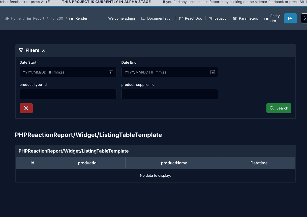
A full data table. This is the one with the most on it: search box, CSV / XLSX / JSON export, saved column preferences, and a compact sidebox variant. Columns come from data.listing, either dynamic ("$data") or an explicit list with per-column map, header, and type.
Two extras live here too and both render: a per-row progression bar colored by ratio, and a nested tree that indents rows from a parent pointer.
Everything about the listing block is written up in the JSON schema.
HTML
Renders markup straight into the widget box. sourceMap is the only key, and it is either literal markup you write, or a $data.<field> that pulls markup out of the row.
{
  "template": { "name": "PHPReactionReport/Widget/HTMLTemplate", "version": 1 },
  "display": { "title": "Notes", "colSpan": 6 },
  "data": { "html": { "sourceMap": "<div>Anything here</div>" } },
}
Literal markup is rendered as-is. Markup that comes from $data.<field> is cleaned with DOMPurify first, since it is data and not something you wrote. See data.html.
Summary
A stacked list of label: value rows. Good for a few totals or a small rollup where a table is too much.
It reads your rows two ways:
- One row of fields: every key in the first row becomes a line (
successis skipped). - A list of
{ label, value }rows: each row becomes a line.
Numbers pass through as-is, and any key with percent in its name gets a % on the end.
// one row, each field is a line
[{ "orders": 128, "revenue": 45210, "conversion_percent": 3.2 }]

// or a list of label/value rows
[
  { "label": "Orders", "value": 128 },
  { "label": "Revenue", "value": 45210 },
]
Meter
Horizontal bars, one per metric. Each bar fills to value / max.
It builds the metrics from your rows in this order:
- A list of
{ label, value }rows: one bar each. - Otherwise the first two
columnsyou name are used as label and value. - Otherwise every numeric field in the first row becomes a bar.
The ceiling for each bar comes from a target, max, total, or goal field on the row if one is present, otherwise the bar just shows the value.
[
  { "label": "Q1", "value": 80, "target": 100 },
  { "label": "Q2", "value": 120, "target": 100 },
]
Gauge
A single dial for one number. It takes the first metric it can find, the same way the meter does (a { label, value } row, or the first two columns, or the first numeric field), and the ceiling comes from a target / max / total / goal field, defaulting to 100.
[{ "label": "Uptime", "value": 99.5, "max": 100 }]Graph
A line chart. The first column is the x-axis, and every other column that holds numbers becomes a line. Header labels name the lines in the legend.
// month is the x-axis; sales and returns are two lines
[
  { "month": "Jan", "sales": 400, "returns": 20 },
  { "month": "Feb", "sales": 480, "returns": 18 },
]
Point the columns at the fields you want with data.graph:
{
  "template": { "name": "PHPReactionReport/Widget/GraphTemplate", "version": 1 },
  "display": { "title": "Sales", "colSpan": 6 },
  "data": { "graph": { "columns": ["month", "sales", "returns"], "headers": "$data" } },
}