IconDropdown Component
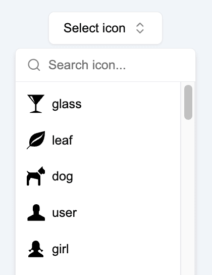
Overview
The IconDropdown component provides access to multiple icon libraries, allowing you to dynamically enable or disable specific sets of icons within your project.
Installation
npm install @phpcreation/frontend-icons-react-nextjs-bundleSetup
To ensure proper functionality, you need to define the base URL for the icon assets in your environment variables.
Add the Base URL to your .env File
NEXT_PUBLIC_ICONS_URL=https://icons.phpr.link/Usage
Importing the Component
In the component where you need the IconDropdown, import it as follows:
- Import the IconDropdown
import { IconDropdown } from "@phpcreation/frontend-icons-react-nextjs-bundle/components";Basic Example
<IconDropdown
  accesses={{
    fontAwesome: true,
    glyphiconsV1: false,
    glyphiconsV2: true,
    phpcApp: false
  }}
/>
For each available library, you can specify which one you want to use in the project
Available Icon Libraries
You can enable or disable the following icon libraries:
| Library Name | Description |
|---|---|
fontAwesome | Enables FontAwesome icons |
glyphiconsV1 | Enables Glyphicons Version 1 |
glyphiconsV2 | Enables Glyphicons Version 2 |
phpcApp | Enables PHP Creation App icons |
Last updated on