DefaultModalSkin
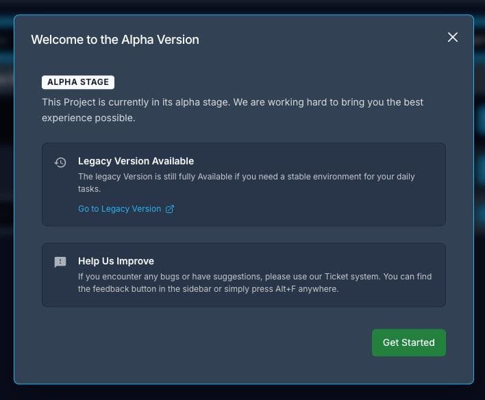
A ready-to-use modal wrapper built on top of Dialog. Handles the portal, overlay, close button, title, and scrollable body. Use this instead of wiring Dialog primitives manually every time you need a standard modal.
Import
import { DefaultModalSkin } from "@phpcreation/frontend-components-react-nextjs-bundle/components";Props
type DefaultModalSkinProps = {
  identifier?: string;              // prefix for element IDs (FQCN)
  title?: string | React.ReactNode; // modal title — translated if string
  isOpen: boolean;
  onClose: () => void;
  children: React.ReactNode;
  isModal?: boolean;                // default: true
  locale?: string;                  // default: "en"
};
Usage
import { DefaultModalSkin } from "@phpcreation/frontend-components-react-nextjs-bundle/components";

<DefaultModalSkin
  title="Edit User"
  isOpen={isOpen}
  onClose={() => setOpen(false)}
>
  <p>Modal content goes here.</p>
</DefaultModalSkin>
With identifier
The identifier prop prefixes all internal element IDs (-content, -title, -body, -container). Pass an FQCN string for consistent DOM targeting and testing.
<DefaultModalSkin
  identifier="user-bundle-edit-modal"
  title="Edit"
  isOpen={isOpen}
  onClose={onClose}
>
  {children}
</DefaultModalSkin>
Example Modal with Default Skin
Notes
- Title strings are run through
useAppTranslations— pass a translation key and it will be translated automatically. - The body div has
max-h-[80vh]withoverflow-y-auto— content scrolls inside the modal, not the page. - Pass
isModal={false}to allow interaction with the page behind the modal without closing it.
Last updated on