General Details
GeneralDetails renders the primary information panel on entity show pages. It displays field values from the entity in a structured key-value layout, driven by entity column metadata.
Import
import { GeneralDetails } from "@phpcreation/frontend-crud-react-nextjs-bundle/components/GeneralDetails";How It Works
Reads entity data from DetailShowContext and renders fields configured with showInDetail: true. Each field value is formatted according to its columnTypeEnum.
| Column Type | Display Format |
|---|---|
TEXT | Plain text |
BOOLEAN | Badge (Active/Inactive) |
DATE | Formatted date string |
SELECT | Label from option |
MANY_TO_MANY | Comma-separated labels |
COLOR | Color swatch |
TEXT_EDITOR | Rendered HTML |
Priority position
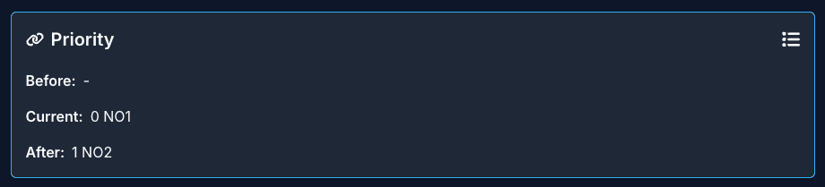
When the show-page config maps fields to the priorityBefore, priorityCurrent, and priorityAfter entities, the section shows where the entity sits in the priority order. The neighbors are fetched with usePriorityNeighbors, and a list icon in the section header links to the priority-sorted listing anchored to this entity (?order[priority]=asc&anchor=<id>).
Tree entities
For entities with nested-set fields, the raw tree keys (lvl, lft, rgt, root, fullParentTree) are hidden from this section. Tree Position renders them instead.
Usage
import { DetailShowContext } from "...";
import { GeneralDetails } from "...";

<DetailShowContext entityConfig={entityConfig} id={entityId}>
  <GeneralDetails fields={entityDetailFields} />
</DetailShowContext>;
Props
| Prop | Type | Description |
|---|---|---|
fields | FieldConfig[] | Fields to display |
layout | "grid" | "list" | Layout mode (default: "grid") |
columns | number | Grid columns (default: 2) |
className | string | Additional CSS classes |